How COVID-19 democratised data visualisation Never before has the whole world been so transfixed by data. The invisibility of the COVID-19 virus and the difficulty of tracing infection means that one of the key methods of understanding its spread is by monitoring the statistics. Governments around the globe have been relying on scenario modelling and predictive algorithms to shape their COVID-19 strategies and inform their response. In the UK, the government’s response is based on the Imperial College study [1] into how infection rates could affect ICU capacity. In the USA, a government-led initiative has seen the release of an open source machine-readable dataset [2] to support efforts utilising innovation, while South Korea have amassed a vast dataset based on population testing that has enabled a civil response that is the envy of the world [3]. Whilst everything we know shifts beneath us, data remains key.
Bridging the gap between experts and the public
However, the data techniques used in the fight against COVID-19 are advanced – Predictive modelling, machine learning/artificial intelligence are key techniques that experts use to extract value from datasets, but are just buzzwords for others. Bridging the gap between the experts and the public falls to data visualisation - the technique used to represent information and statistics in the form of graphs, which news organisations and governments alike have used to effectively report on the pandemic.
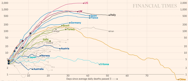
Credit: John Burn-Murdoch, Financial Times, sourced 20th April 13:20 [4]
The embracing of visual reporting has enabled the public to contextualise COVID-19 information as soon as they receive it. Let us take, for example, the announcement that 938 COVID-19 deaths tragically occurred amongst those hospitalised in the UK on Tuesday 8th April. At the time, this was the highest UK daily total and one that was worryingly close to the four-digit milestone, seemingly meaning the situation was continuing to get worse and worse. However, one only needed to look at the Financial Times graphic showing a 7-point moving average (shown above) to realise that actually, we were seeing a potential deceleration of daily deaths.

Credit: Centre for Disease Prevention and Control, USA, sourced 20th April 13:27 [5]
Its effectiveness as a reporting tool during this pandemic has propelled data visualisation into the mainstream, symbolised by the widespread use of the expression ‘flatten the curve’. Every day millions of people turn to their news source to look at graphs tracking COVID-19’s key data points - The Financial Times, for example, saw a 98% increase in monthly website traffic in March [6]. This uptick in the use and consumption of data visualisation is a COVID-19 trend that could potentially stick, and with that, a possible shift in the expectation of consumers.
Data visualisation for consumers
The use cases for data visualisation in the B2C world are almost endless. Consumers may begin to question why, for example, their mobile provider gives them a single figure to show them their data usage. Why can they not see it visualised over a month, so they can more easily interpret their remaining allowance and plan accordingly? Business may be becoming accustomed to using data visualisations to run their organisations efficiently and they may find their customers will begin to expect it as well. The challenge of making data meaningful, and the consumers growing appetite for it, means business needs to move up a gear.
At NTT DATA, we understand the needs of individual customers. We bring together user-focused experience design with enterprise-level data insight to help businesses communicate more effectively with their customers. The opportunities that can be realised through effective visualisation of data, such as upselling and increased customer retention, can be realised across the B2C spectrum. If you would like to know more about how data visualisation can help you connect with your customers, please get in touch.
References
[1] https://www.imperial.ac.uk/media/imperial-college/medicine/mrc-gida/2020-03-16-COVID19-Report-9.pdf
[3] https://www.wired.co.uk/article/south-korea-coronavirus